background
The problem
Enrolment excessive number of fields
The British Airways Executive Club (BAEC) requires you to fill out a 19 field form to register an account. This complexity can significantly impact the application process. One of the major issues is the excessive number of fields, which can lead to application fatigue and increase the likelihood of errors. Additionally, long forms may discourage potential applicants right from the start, as the estimated effort required to complete them may seem too long to complete.
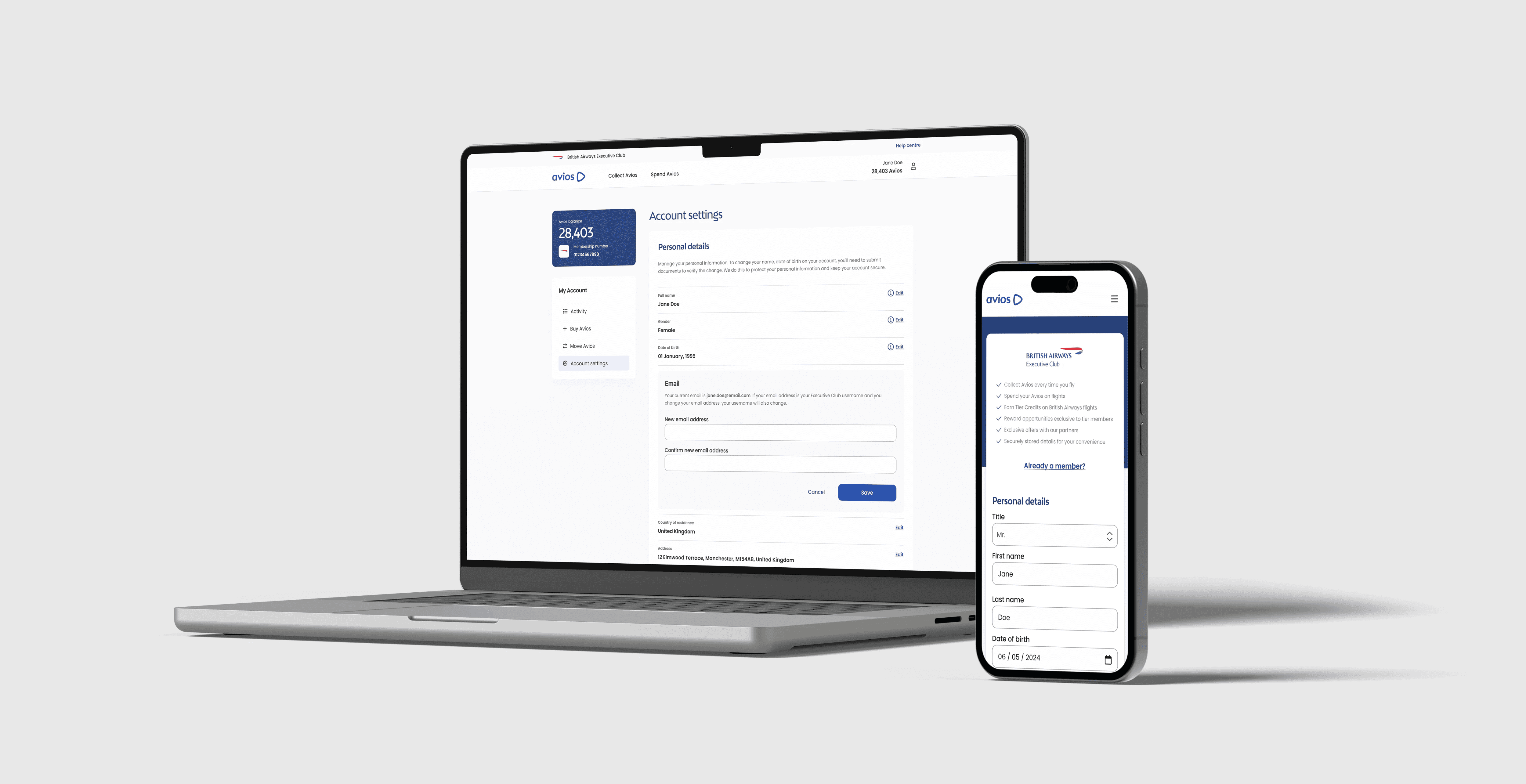
Manage Account settings
As part of the enrolment process, it was imperative to design also the user interface elements of My Account that would allow for ongoing account settings and personal information management.
The Challenge
Simplify Enrolment process
Balancing data collection with user experience is a key challenge in enrolment form design. While creating a streamlined, user-friendly process is essential, it often conflicts with the practical need to collect detailed information. To address this, I must carefully identify the most critical data points and prioritise them over less essential fields, which can be made optional and completed later in the manage account settings.
Reduce Process time
Research & Discovery
Competitive Research
My research focused on analysing the enrolment processes and post-enrolment account management strategies of other major airlines. The goal was primarily to identify best practices and areas for improvement in attracting and retaining loyalty program members.
The research focused on key aspects of the customer onboarding experience, in particular; complexity vs simplicity of the enrolment procedure, quality of the initial welcome experience, clarity of onboarding materials, the use of incentives to foster engagement, and effectiveness of post-enrolment communication strategies.
The findings indicated a significant variance in the quality of onboarding practices among the airlines studied. While some airlines demonstrated optimised enrolment procedures and provided comprehensive post-enrolment support, others adopted less efficient processes and offered limited guidance to new members. This analysis identifies potential areas for improvement in onboarding strategies, aiming to improve customer satisfaction and encourage continued engagement.
Define Requirements & Goals
Defining the criteria for the register form involves identifying the essential user information required for account creation, aiming for minimal fields to optimise the sign-up process. It also requires outlining security protocols, such as password complexity rules and bot prevention measures, alongside any legal or compliance requirements, such as data privacy consent.
For the account settings, this stage outlines editable user information (profile, contact, security, payment), permissible actions (password change, updates, deletion). This stage ensures a solid understanding of both functional and non-functional needs for registration and account management, laying the foundation for subsequent development, while considering third-party integrations, but always recognising the technical limitations.
Testing & Iteration
Signup form - A/B Testing
An A/B test was conducted to compare user preferences between two signup form styles: a progressive multi-step form and a streamlined single-step form.
Although both formats received similar preference rates, users overwhelmingly favoured the single-step version for its faster submission process.
In conclusion, while users found the progressive layout to be more visually appealing and to induce a smoother, more confident user experience by being less overwhelming, they preferred the single-step form for its practical advantages. The single-step form worked better with browser autofill, which significantly reduced the completion time on average. Additionally, it allowed users to review their information more efficiently before submitting, which strengthened the overall user experience.
Implementation
An effective signup form optimises a balance between simplicity, usability, trust, and visual clarity to deliver a pleasing user experience.
This was achieved by minimising the number of fields to only the essentials, arranging them logically, and grouping related information for better organisation (e.g., personal details, login details, and terms & conditions). Interactions were enhanced through the use of clear labels and real-time inline error validation, allowing users to navigate smoothly and confidently through the form without frustration.
At the same time, fostering trust by including reassuring elements like explanations for required data, visible indicators of security levels, privacy statements and ensuring a mobile-responsive and accessible design, providing to diverse users and devices.

Conclusion
Future Opportunities - Suggestions
Dynamic Location Selection
The initial designs included a dynamic location selection feature, which automatically detects the user’s geographic location by the IP geolocation or browser settings. Based on this information, the system pre-fills the Country field in the form, simplifying the user experience by reducing manual input and ensuring greater accuracy. Users can still override the selection if needed, offering both convenience and flexibility.
Address Lookup
Also as part of the proposed designs to reduce manual input, was to implement an Address Lookup functionality, allowing users to enter a partial address or postal code to receive suggested address options. This eliminates the need to manually complete the address, city, and postcode fields. However, due to technical constraints, this feature could not be implemented in time for the online launch.
What I learned
Working on this project provided valuable insights into the significance of apparently simple elements, such as the enrolment process form and account management. While these features may appear straightforward at first glance, I discovered that their design and implementation can have a profound impact on user acquisition and engagement. The challenge lies in the finer details—how fields are structured, how intuitive the flow is, and how potential barriers can be minimised to create a smooth experience.
One of the most important lessons I learned is to never rely on my own assumptions. What might seem obvious or visually appealing from a designer’s perspective does not always align with user preferences or expectations. This realisation underscored the importance of usability testing and gathering real-world feedback to validate design decisions. By understanding how users interact with these features and collecting their feedback, we can make adjustments that enhance their experience.
This project was an invaluable learning experience, demonstrating how even minor refinements in design and functionality can significantly influence the success of a platform and its ability to attract and retain users.