Starkdata is an AI-powered predictive analytics platform that helps retail organizations manage the entire customer lifecycle, from acquisition to retention. It uses artificial intelligence and machine learning to analyse behavioural patterns, predict churn, and generate strategic insights that help teams optimize customer loyalty and improve revenue consistency. The system integrates behavioural segmentation, sentiment analysis, and churn prediction into a single interface that supports proactive engagement decision-making.
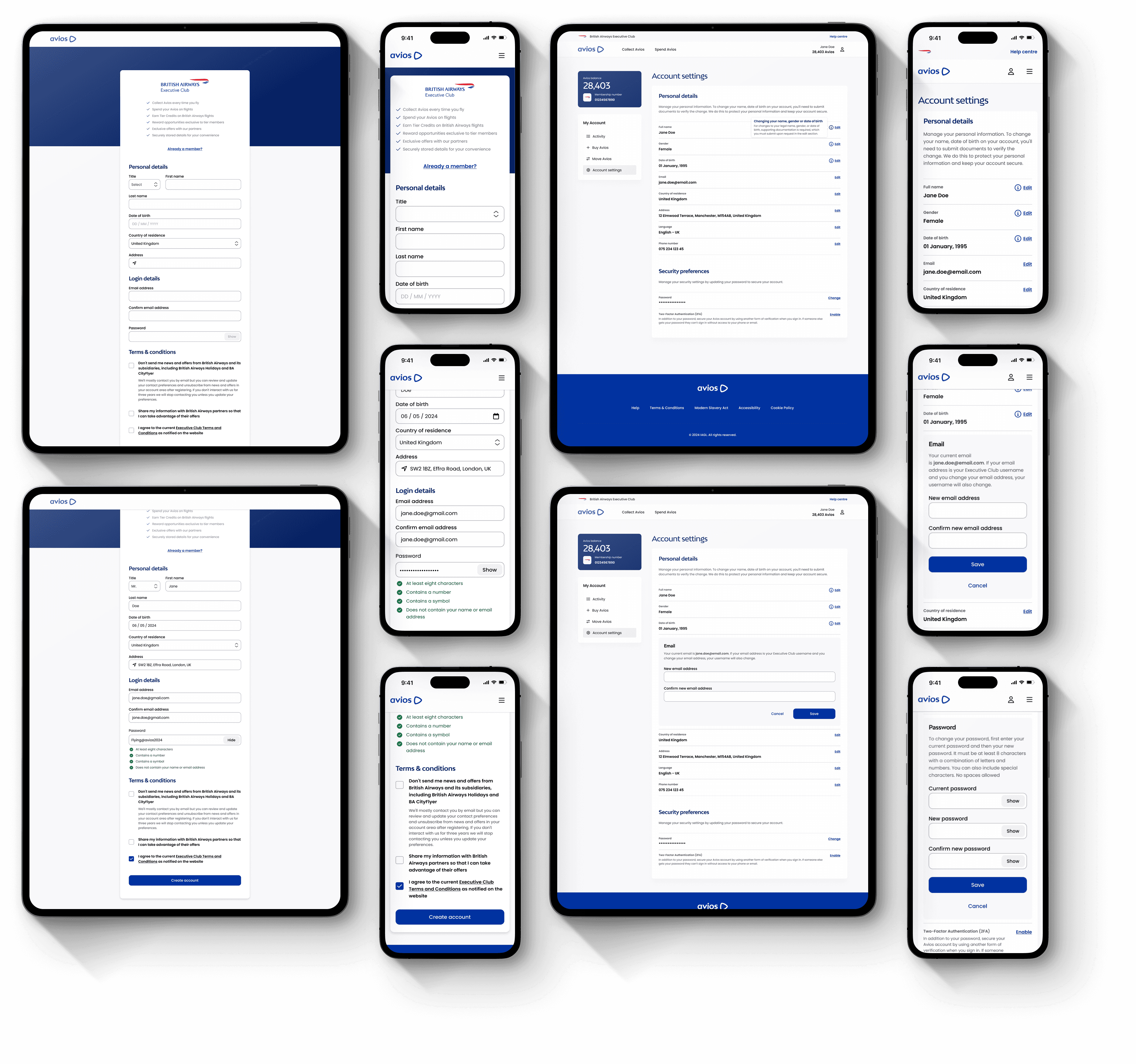
Develop intuitive, data-driven interfaces to enhance analytics and insight delivery. Define effective visualization strategies by analysing complex datasets in collaboration with stakeholders to design innovative, user-centred features.
2021
The Challenge
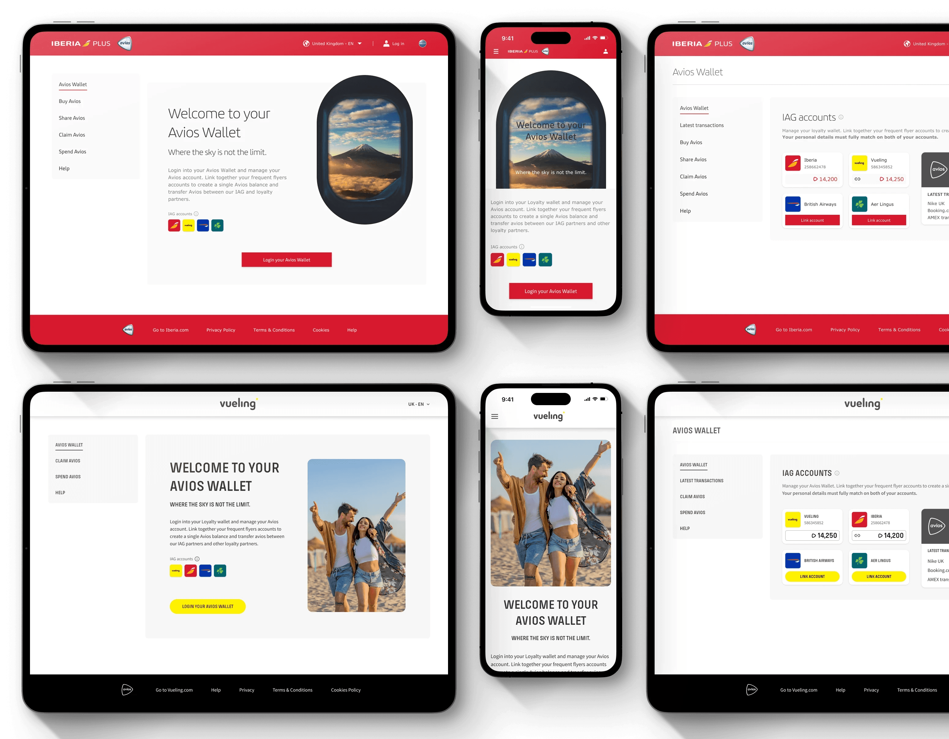
The project involved designing a data-driven visual strategy supported by artificial intelligence (AI) and machine learning (ML), analysing data to create user-focused visualisations that clearly communicate insights. It also included developing adaptable interface environments for retail, banking, and healthcare sectors, ensuring flexibility to accommodate market trends and content diversity, while delivering a seamless digital experience through high-fidelity mock-ups, user flows, and a cohesive design system.
The Problem
data complexity
Users frequently experience difficulty in interpreting insights due to the volume and diversity of available information. The absence of an intuitive structure in the interface resulted in slower decision-making and frustration during data exploration. To improve comprehension and lessen mental strain, users required a clear, meaningful method of interacting with complex datasets.
Lack of personalisation
Research
Understanding the Target Users and Context
Primary users are retail/sales managers, marketing teams, and customer services representatives who rely on customer data to guide strategic business decisions. These users work with multiple datasets — sales, engagement, and customer sentiment — and require a dashboard that consolidates data points into intuitive visual components.
user personas
In order to gain a deeper understanding and empathy for our user target, was created 3 main user personas based on the research findings from our stakeholders and retail clients. This enabled me to step into their shoes, imagining their daily routines, challenges, and aspirations, to ensure a user-centred design process.
Market and Competitors
Tools like Salesforce and SAP dominate the enterprise analytics space, but their biggest strength is also a major UX challenge.
Salesforce is praised for its strong AI-powered analytics, automation, and flexible forecasting features, but users often describe it as “intimidating” due to its in-depth customisation and overloaded dashboards.
SAP, on the other hand, excels in enterprise-grade scalability and advanced reporting, yet its complexity and poorly prioritised visual hierarchy create friction for business users, making it challenging to navigate data visualisations efficiently or identify actionable insights at a glance.
This means both systems are capable of providing comprehensive insights; however, they are deficient in intuitive workflows, especially for retail professionals who aren't tech-savvy but demand clear information and quick feedback.
Data visualisation
Data literacy was essential for understanding different types of data and their characteristics, concepts, and techniques. In order to apply critical thinking and effective communication, it is crucial to identify potential biases in data collection to effectively communicate insights to different audiences by employing appropriate language and data visualisations.
Process
Simplicity
Simplify the interface by adopting a minimalist visual language that emphasises clean structure, generous white space, and balanced composition for intuitive navigation. Use straightforward charts and a restrained color palette to reduce visual noise, ensuring that key data and insights stand out clearly.
Prototyping
Geographic performance
Tracking location to understand and identify sales patterns within the area.
Sales forecast
Predict sales/revenue forecast through statistical modelling techniques to analyse historical data and identify complex relationships that can be used to predict future sales.
Next best action (NBA)
Combines data analytics and artificial intelligence to enable companies to better understand their customers and anticipate their needs. It provides pertinent and specialised interactions with customers/clients across all channels, delivering highly personalised experiences that culminate in improved experiences, productivity, and a higher customer lifetime value.
External factors
There are external elements that can influence its operations, performance, or outcomes during a certain time frame.
This information is crucial for both sales and marketing tactics, as well as for managing stocks and distribution.
Sentiment analysis
Understand customers' emotions towards products, brands, and services. Analyse customer behaviour towards sales and customer service. Gather these insights to refine services, venture into a new market when releasing new products, or while upgrading existing products. Get powerful insights to boost marketing strategy by keeping an eye on industry trends by analysing sentiment towards new features or products on social media.
Design System
Conclusion
Results
Recognising the budget limitations typical of early-stage startups, we adopted a streamlined, collaborative design approach. We bypassed formal usability testing, instead engaging directly with stakeholders and early clients in brainstorming sessions. This project, despite its resource constraints, was an invaluable learning experience that ultimately led to the successful delivery of the product. However, there is still much to be refined as the product receives additional feedback.