Industry

Loyalty Programmes

Year

2024

Deliverables

Research · UX/UI · Prototyping · Usability testing · QA Design

01

Problem

Excessive number of fields

The British Airways Executive Club (BAEC) registration currently asks for 19 fields. That’s not just a form; it’s a mood test. The length alone can trigger application fatigue, invite errors, and make potential members wonder whether joining a loyalty program is meant to be a quick win or a small endurance challenge.

Manage account settings

As part of the enrolment process, it was also crucial to improve the profile account, so members could manage their personal data and change their settings later with the same confidence they use to book a flight.

Excessive number of fields

The British Airways Executive Club (BAEC) registration currently asks for 19 fields. That’s not just a form; it’s a mood test. The length alone can trigger application fatigue, invite errors, and make potential members wonder whether joining a loyalty program is meant to be a quick win or a small endurance challenge.

Manage account settings

As part of the enrolment process, it was also crucial to improve the profile account, so members could manage their personal data and change their settings later with the same confidence they use to book a flight.

Excessive number of fields

The British Airways Executive Club (BAEC) registration currently asks for 19 fields. That’s not just a form; it’s a mood test. The length alone can trigger application fatigue, invite errors, and make potential members wonder whether joining a loyalty program is meant to be a quick win or a small endurance challenge.

Manage account settings

As part of the enrolment process, it was also crucial to improve the profile account, so members could manage their personal data and change their settings later with the same confidence they use to book a flight.

Excessive number of fields

The British Airways Executive Club (BAEC) registration currently asks for 19 fields. That’s not just a form; it’s a mood test. The length alone can trigger application fatigue, invite errors, and make potential members wonder whether joining a loyalty program is meant to be a quick win or a small endurance challenge.

Manage account settings

As part of the enrolment process, it was also crucial to improve the profile account, so members could manage their personal data and change their settings later with the same confidence they use to book a flight.

02

Challenge

1. Simplify the enrolment process

Enrolling shouldn’t feel like applying for a mortgage. Yes, we love data, but not at the cost of someone questioning their life choices halfway through a form. The trick is to ask only what truly matters upfront, and leave the “nice-to-know” details for later. After all, a relationship builds over time, no need to ask for everything on the first date.

2. Reduce process time

Speed matters, but not the kind where users click “next” with the confidence of someone skipping terms and conditions. The goal isn’t just a shorter form, it’s a smarter one: fewer distractions, clearer and intent steps, and just enough guidance, so people don’t accidentally sign up as “Mr. John Doe.” Efficient, accurate, and just human enough to feel painless.

1. Simplify the enrolment process

Enrolling shouldn’t feel like applying for a mortgage. Yes, we love data, but not at the cost of someone questioning their life choices halfway through a form. The trick is to ask only what truly matters upfront, and leave the “nice-to-know” details for later. After all, a relationship builds over time, no need to ask for everything on the first date.

2. Reduce process time

Speed matters, but not the kind where users click “next” with the confidence of someone skipping terms and conditions. The goal isn’t just a shorter form, it’s a smarter one: fewer distractions, clearer and intent steps, and just enough guidance, so people don’t accidentally sign up as “Mr. John Doe.” Efficient, accurate, and just human enough to feel painless.

1. Simplify the enrolment process

Enrolling shouldn’t feel like applying for a mortgage. Yes, we love data, but not at the cost of someone questioning their life choices halfway through a form. The trick is to ask only what truly matters upfront, and leave the “nice-to-know” details for later. After all, a relationship builds over time, no need to ask for everything on the first date.

2. Reduce process time

Speed matters, but not the kind where users click “next” with the confidence of someone skipping terms and conditions. The goal isn’t just a shorter form, it’s a smarter one: fewer distractions, clearer and intent steps, and just enough guidance, so people don’t accidentally sign up as “Mr. John Doe.” Efficient, accurate, and just human enough to feel painless.

1. Simplify the enrolment process

Enrolling shouldn’t feel like applying for a mortgage. Yes, we love data, but not at the cost of someone questioning their life choices halfway through a form. The trick is to ask only what truly matters upfront, and leave the “nice-to-know” details for later. After all, a relationship builds over time, no need to ask for everything on the first date.

2. Reduce process time

Speed matters, but not the kind where users click “next” with the confidence of someone skipping terms and conditions. The goal isn’t just a shorter form, it’s a smarter one: fewer distractions, clearer and intent steps, and just enough guidance, so people don’t accidentally sign up as “Mr. John Doe.” Efficient, accurate, and just human enough to feel painless.

03

Research

Customer insight

Customers have been fairly consistent in their feedback: registering with British Airways can feel longer than the flight itself. The process is often perceived as long, demanding, and occasionally confusing, thanks to complex form fields and frequent validation hiccups.

Unsurprisingly, many users decide to abandon the journey before reaching the finish line. Drop-off rates suggest that perhaps loyalty is hard to earn when the first interaction feels like a small obstacle course.

Customer insight

Customers have been fairly consistent in their feedback: registering with British Airways can feel longer than the flight itself. The process is often perceived as long, demanding, and occasionally confusing, thanks to complex form fields and frequent validation hiccups.

Unsurprisingly, many users decide to abandon the journey before reaching the finish line. Drop-off rates suggest that perhaps loyalty is hard to earn when the first interaction feels like a small obstacle course.

Customer insight

Customers have been fairly consistent in their feedback: registering with British Airways can feel longer than the flight itself. The process is often perceived as long, demanding, and occasionally confusing, thanks to complex form fields and frequent validation hiccups.

Unsurprisingly, many users decide to abandon the journey before reaching the finish line. Drop-off rates suggest that perhaps loyalty is hard to earn when the first interaction feels like a small obstacle course.

Customer insight

Customers have been fairly consistent in their feedback: registering with British Airways can feel longer than the flight itself. The process is often perceived as long, demanding, and occasionally confusing, thanks to complex form fields and frequent validation hiccups.

Unsurprisingly, many users decide to abandon the journey before reaching the finish line. Drop-off rates suggest that perhaps loyalty is hard to earn when the first interaction feels like a small obstacle course.

Competitive benchmark research

A review of enrolment and account management across major airlines revealed a wide spectrum of approaches. The analysis focused on registration efficiency, onboarding quality, incentives, and communication. Some airlines clearly invest in making new members feel welcomed and supported, while others take a more hands-off approach.

These insights highlight clear opportunities to elevate the onboarding experience—making it not only easier to join, but also more compelling to stay.

Competitive benchmark research

A review of enrolment and account management across major airlines revealed a wide spectrum of approaches. The analysis focused on registration efficiency, onboarding quality, incentives, and communication. Some airlines clearly invest in making new members feel welcomed and supported, while others take a more hands-off approach.

These insights highlight clear opportunities to elevate the onboarding experience—making it not only easier to join, but also more compelling to stay.

04

Ideation

Define requirements and goals

Defining the registration form criteria meant being selective because asking for every possible detail upfront is a great way to make users disappear quietly. The focus was on capturing essential user data only, nothing that would make someone question whether they’re signing up for an account or a tax declaration. However, security requirements such as password rules, fraud prevention, and data privacy consent were non-negotiable, however, they were displayed as invisible guardrails rather than conspicuous obstacles.

The account settings page was designed to handle everything that didn’t need to join the party on day one. This included editable personal information and authentication controls, ensuring the wider registration and account management experience was grounded in clear functional and non-functional requirements, while still respecting third-party integrations and technical constraints.

Key principles

01

Simplify form fields: Fewer fields, less effort, fewer opportunities for users to suddenly remember they have something else to do.

02

Real-time validation: Immediate feedback helps users fix issues on the spot, instead of being ambushed by a wall of errors at the end.

03

Reduce distraction: No extra links, promotional detours, or enthusiastic reminders about membership benefits while users are just trying to sign up in peace.

04

Email verification timing: Instant checks for obvious mistakes (missing “@”, no “.com”, or the legendary “gmail.om” or "gmial.com"), so users don’t complete the entire form and then discover their email is a creative writing exercise.
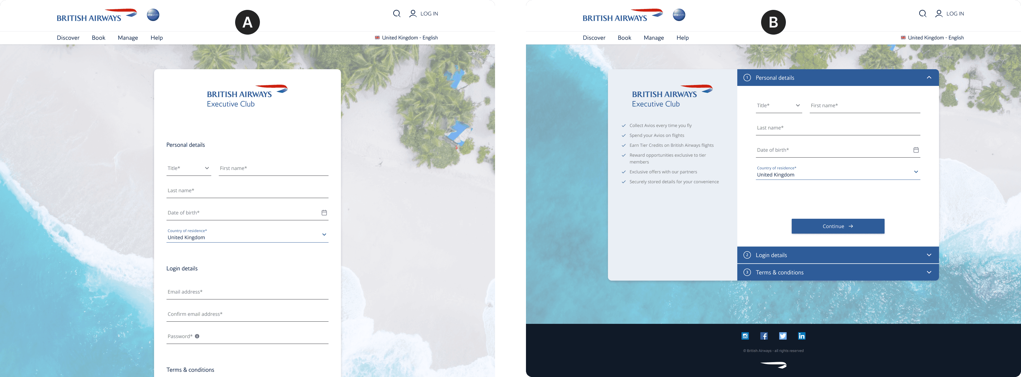
Signup form - A/B Testing

An A/B test compared two sign-up form styles: a progressive multistep form and a simple single-step form.
Preference rates were similar, but when it came down to real behaviour, users clearly leaned toward the single-step version. It submitted faster, worked better with autofill, and made reviewing information feel like a quick glance rather than a scenic tour.

05

Solution

Implementation

An effective sign-up form needs to balance simplicity, usability, trust, and visual clarity, without making the user feel like they’re being interrogated. We reduced fields to only what’s truly necessary, structured them in a logical flow, and grouped related information so users can see the pattern instead of guessing it. Real-time validation and clear labels meant mistakes were caught and corrected on the spot, not celebrated later with an error explosion.

To build trust, we added simple explanations for required data, visible security indicators, and clear privacy statements. The form is also mobile-responsive and accessible, so it works well on any device and for any user.

Dynamic location and Address lookup

Dynamic location selection feature that detects the user’s geographic location via IP geolocation or browser settings and pre-fills the Country field. This reduces manual input and improves accuracy, while still allowing users to override the selection if the system decides they’re currently in a different country.

Also to reduce manual input, an address lookup functionality was also planned: users enter a partial address or postal code and get suggested address options.

Implementation

An effective sign-up form needs to balance simplicity, usability, trust, and visual clarity, without making the user feel like they’re being interrogated. We reduced fields to only what’s truly necessary, structured them in a logical flow, and grouped related information so users can see the pattern instead of guessing it. Real-time validation and clear labels meant mistakes were caught and corrected on the spot, not celebrated later with an error explosion.

To build trust, we added simple explanations for required data, visible security indicators, and clear privacy statements. The form is also mobile-responsive and accessible, so it works well on any device and for any user.

Dynamic location and Address lookup

Dynamic location selection feature that detects the user’s geographic location via IP geolocation or browser settings and pre-fills the Country field. This reduces manual input and improves accuracy, while still allowing users to override the selection if the system decides they’re currently in a different country.

Also to reduce manual input, an address lookup functionality was also planned: users enter a partial address or postal code and get suggested address options.

Implementation

An effective sign-up form needs to balance simplicity, usability, trust, and visual clarity, without making the user feel like they’re being interrogated. We reduced fields to only what’s truly necessary, structured them in a logical flow, and grouped related information so users can see the pattern instead of guessing it. Real-time validation and clear labels meant mistakes were caught and corrected on the spot, not celebrated later with an error explosion.

To build trust, we added simple explanations for required data, visible security indicators, and clear privacy statements. The form is also mobile-responsive and accessible, so it works well on any device and for any user.

Dynamic location and Address lookup

Dynamic location selection feature that detects the user’s geographic location via IP geolocation or browser settings and pre-fills the Country field. This reduces manual input and improves accuracy, while still allowing users to override the selection if the system decides they’re currently in a different country.

Also to reduce manual input, an address lookup functionality was also planned: users enter a partial address or postal code and get suggested address options.

Implementation

An effective sign-up form needs to balance simplicity, usability, trust, and visual clarity, without making the user feel like they’re being interrogated. We reduced fields to only what’s truly necessary, structured them in a logical flow, and grouped related information so users can see the pattern instead of guessing it. Real-time validation and clear labels meant mistakes were caught and corrected on the spot, not celebrated later with an error explosion.

To build trust, we added simple explanations for required data, visible security indicators, and clear privacy statements. The form is also mobile-responsive and accessible, so it works well on any device and for any user.

Dynamic location and Address lookup

Dynamic location selection feature that detects the user’s geographic location via IP geolocation or browser settings and pre-fills the Country field. This reduces manual input and improves accuracy, while still allowing users to override the selection if the system decides they’re currently in a different country.

Also to reduce manual input, an address lookup functionality was also planned: users enter a partial address or postal code and get suggested address options.

User flow and responsive screen breakpoints

The blueprint for the user journey, which outlines the steps from sign-up to initial use and ensures that it functions properly on desktops, tablets, and smartphones.

Design system

While this project was being developed, the design system was also in progress. I wasn’t leading it, but I was part of the discovery squad: a group of contributor designers who consistently provided content, feedback, and general reality checks to make sure the system matured in line with actual product needs.

06

Conclusion

What I learned

This project taught me that even the “simplest” parts of a product, like an enrolment form, can quietly decide whether users join, stay, or quickly leave. The difference between “fine” and “great” is often hidden in tiny details: how fields are ordered, how intuitive the flow feels, and how many small obstacles you can remove before users realise it is not worth their time.

One of the biggest lessons was to stop trusting my own assumptions. As a designer, I can easily think something is obvious, elegant, or perfectly clear, until a user proves me wrong and finds it’s confusing, annoying, or just surprisingly challenging. That gap is precisely why usability testing and real feedback matter.

Overall, this project was a strong reminder that small refinements can have a big impact on a platform’s success. In other words, the devil is in the details, and sometimes, those details are the ones that make users wonder if the form is worth their time.

What I learned

This project taught me that even the “simplest” parts of a product, like an enrolment form, can quietly decide whether users join, stay, or quickly leave. The difference between “fine” and “great” is often hidden in tiny details: how fields are ordered, how intuitive the flow feels, and how many small obstacles you can remove before users realise it is not worth their time.

One of the biggest lessons was to stop trusting my own assumptions. As a designer, I can easily think something is obvious, elegant, or perfectly clear, until a user proves me wrong and finds it’s confusing, annoying, or just surprisingly challenging. That gap is precisely why usability testing and real feedback matter.

Overall, this project was a strong reminder that small refinements can have a big impact on a platform’s success. In other words, the devil is in the details, and sometimes, those details are the ones that make users wonder if the form is worth their time.

What I learned

This project taught me that even the “simplest” parts of a product, like an enrolment form, can quietly decide whether users join, stay, or quickly leave. The difference between “fine” and “great” is often hidden in tiny details: how fields are ordered, how intuitive the flow feels, and how many small obstacles you can remove before users realise it is not worth their time.

One of the biggest lessons was to stop trusting my own assumptions. As a designer, I can easily think something is obvious, elegant, or perfectly clear, until a user proves me wrong and finds it’s confusing, annoying, or just surprisingly challenging. That gap is precisely why usability testing and real feedback matter.

Overall, this project was a strong reminder that small refinements can have a big impact on a platform’s success. In other words, the devil is in the details, and sometimes, those details are the ones that make users wonder if the form is worth their time.

What I learned

This project taught me that even the “simplest” parts of a product, like an enrolment form, can quietly decide whether users join, stay, or quickly leave. The difference between “fine” and “great” is often hidden in tiny details: how fields are ordered, how intuitive the flow feels, and how many small obstacles you can remove before users realise it is not worth their time.

One of the biggest lessons was to stop trusting my own assumptions. As a designer, I can easily think something is obvious, elegant, or perfectly clear, until a user proves me wrong and finds it’s confusing, annoying, or just surprisingly challenging. That gap is precisely why usability testing and real feedback matter.

Overall, this project was a strong reminder that small refinements can have a big impact on a platform’s success. In other words, the devil is in the details, and sometimes, those details are the ones that make users wonder if the form is worth their time.

Create a free website with Framer, the website builder loved by startups, designers and agencies.