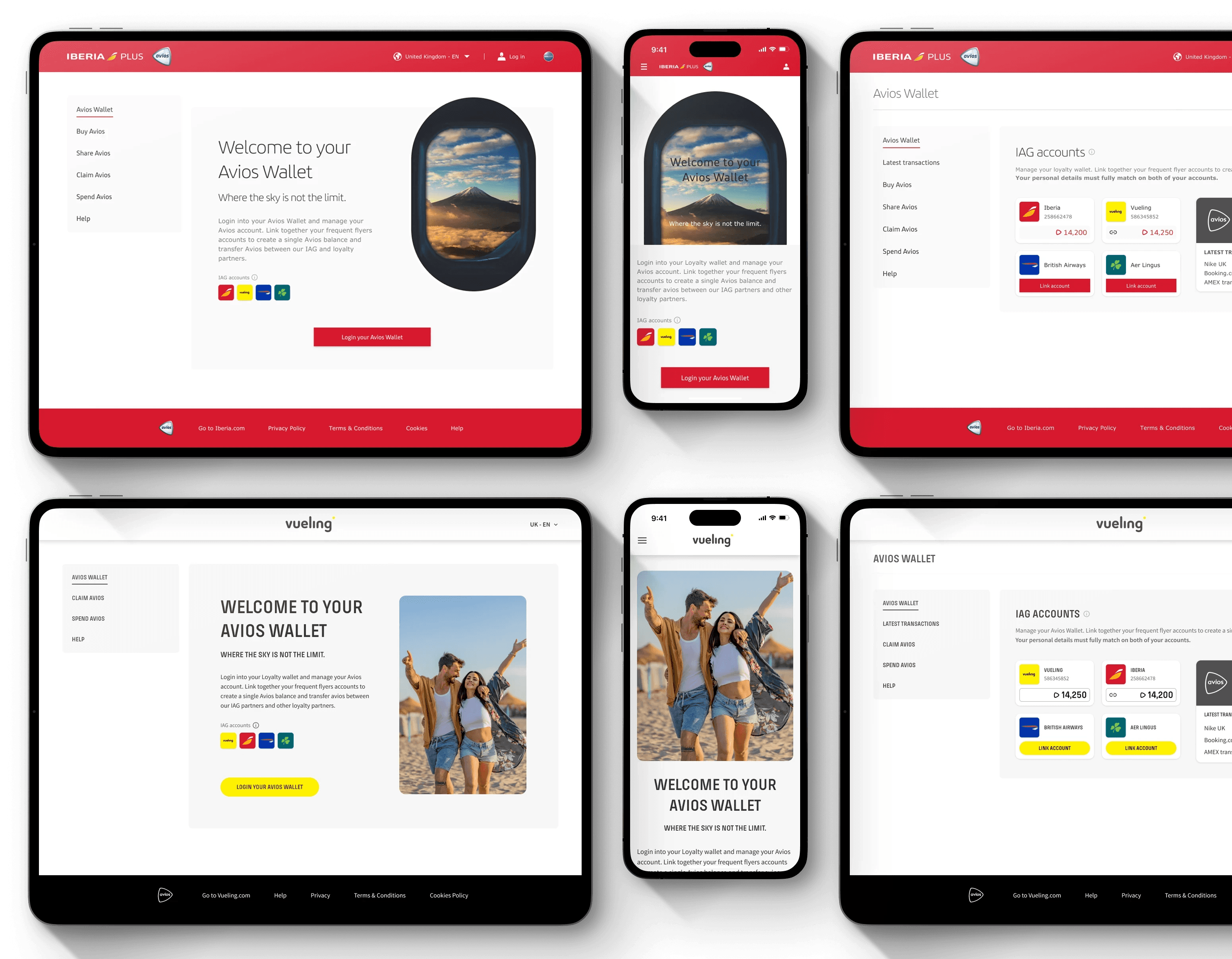
Avios.com is IAG Loyalty’s central location for Avios points, serving members of British Airways Executive Club, Iberia Plus, Aer Lingus AerClub, and Vueling Club. It enables users to earn, manage, and redeem points across multiple airlines and partners.
Responsible for the UX and product design of the "Enrollment" and "My Account", conducting usability tests and refining the MVP to improve the registration process and provide a user-friendly solution for the account management journey.
Gathered research insights, tested early concepts using UserTesting, refined user flows, created wireframes, defined the MVP, and developed a detailed prototype in Figma for further testing and iteration.
Increased the number of new BAEC members by 5.6% through the Avios.com enrollment process, and reduced the process time by 40%.
2024
Simplify Enrolment process
Balancing data collection with user experience is a key challenge in enrolment form design. While optimised processes are essential, they often conflict with the need for detailed information. The solution is prioritising critical data points over less essential fields, which can be made optional or completed afterwards in account settings.
Reduce Process time
excessive number of fields
The British Airways Executive Club (BAEC) registration requires a 19-field form, which creates several problems. This excessive length causes application fatigue, increases errors, and may discourage potential members from completing the process due to perceived time commitment.
Manage Account settings
As part of the enrolment process, it was imperative to refine the "My Account" that allows for members account settings and personal information management.
Research
Customer insight
Customers have consistently expressed frustration with the British Airways registration process, highlighting it as overly long and time-consuming. It also revealed that new members frequently encounter demanding registration steps, including complicated form fields and frequent validation errors.
These issues ultimately lead to high drop-off rates, with many users abandoning registration before completion due to the process’s complexity and delays.
Competitive benchmark Research
The research examined the enrollment and account management processes of major airlines to identify strategies to attract and retain loyalty program members. The focus was on the efficiency of registration, the welcome experience, onboarding, incentives, and communication.
The findings indicated a significant disparity in the quality of onboarding practices among the airlines. While some optimised enrolment procedures and provided comprehensive post-enrolment support, others adopted less efficient processes and offered limited guidance to new members.
This analysis identified potential areas for improvement in onboarding strategies, aiming to improve customer satisfaction and encourage continued engagement.

Define Requirements & Goals (MVP)
Defining the register form criteria involves selecting only essential user data to simplify sign-up. It also requires outlining security protocols, such as password rules and prevention measures, alongside any legal or compliance requirements, such as data privacy consent.
The account settings page should contain editable user information and authentication controls. This ensures that the complete registration and account management process is based on clear functional and non-functional requirements, while also considering third-party integrations and sticking to technical constraints.
To reduce registration dropouts, these were consider:
↠ Simplify form fields: Fewer input fields to reduce user effort.
↠ Real-time validation: Immediate form field validation and error feedback instead of post-submission messages to minimize frustration.
↠ Reduce distraction: No extra links or ads regarding the membership advantages.
↠ Email verification timing: Instant email verification (i.e. @ and .com)
Signup form - A/B Testing
An A/B test compared two sign-up form styles: a progressive multistep form and a simple single-step form. Despite similar preference rates, users clearly favoured the single-step version for its faster submission, better autofill compatibility, and easier information review.
While the progressive form felt smoother and more visually appealing, the single-step option offered greater efficiency and a stronger overall user experience.
Process & Solution
Implementation
An effective sign-up form optimises a balance between simplicity, usability, trust, and visual clarity to deliver a pleasing user experience.
This was achieved by minimising the number of fields to only the essentials, arranging them logically, and grouping related information for better organisation (e.g., personal details, login details, and terms & conditions). Interactions were enhanced through the use of clear labels and real-time inline error validation, allowing users to navigate smoothly and confidently through the form without frustration.
At the same time, fostering trust by including reassuring elements like explanations for required data, visible indicators of security levels, privacy statements and ensuring a mobile-responsive and accessible design, providing to diverse users and devices.


While this project was being developed, the design system was also in progress. Although I was not responsible for leading the design system, I was part of the discovery squad — a group of contributor designers who would consistently provide content, feedback and ensure the system matured in line with product needs.
Conclusion
Future Opportunities - Suggestions
Dynamic Location Selection
The initial designs included a dynamic location selection feature, which automatically detects the user’s geographic location by the IP geolocation or browser settings. Based on this information, the system pre-fills the Country field in the form, simplifying the user experience by reducing manual input and ensuring greater accuracy. Users can still override the selection if needed, offering both convenience and flexibility.
Address Lookup
Also as part of the proposed designs to reduce manual input, was to implement an Address Lookup functionality, allowing users to enter a partial address or postal code to receive suggested address options. This eliminates the need to manually complete the address, city, and postcode fields. However, due to technical constraints, this feature could not be implemented in time for the online launch.
What I learned
Working on this project provided valuable insights into the significance of apparently simple elements, such as the enrolment process form and account management. While these features may appear straightforward at first glance, I discovered that their design and implementation can have a profound impact on user acquisition and engagement. The challenge lies in the finer details—how fields are structured, how intuitive the flow is, and how potential barriers can be minimised to create a smooth experience.
One of the most important lessons I learned is to never rely on my own assumptions. What might seem obvious or visually appealing from a designer’s perspective does not always align with user preferences or expectations. This realisation underscored the importance of usability testing and gathering real-world feedback to validate design decisions. By understanding how users interact with these features and collecting their feedback, we can make adjustments that enhance their experience.
This project was an invaluable learning experience, demonstrating how even minor refinements in design and functionality can significantly influence the success of a platform and its ability to attract and retain users.